Verdant
Verdant is a product I conceptualized and designed from the ground up. Verdant tracks and communicates sustainability goals derived from the completed Life Cycle Assessment of a specific commodity. This app provides data and analytics on green goal progress in an understandable way for users, such that communication is facilitated, goals are reached more quickly, and corporations lessen their impact on our environment.
Life Cycle Assessment (LCA) is a methodology for quantifying the sustainability of a product, material, or process over the course of its entire life cycle. Conducting an LCA demonstrates the environmental implications of the many interacting systems that make up industrial production. The goal of conducting an LCA is generally to support sustainability initiatives.
Verdant is an app that allows the user to set goals for key components of a life cycle, and is geared towards a product versus a material or process. I designed the app for users who desire to move their products from a linear production model to a circular life cycle.
The app is based on the assumption that the user has conducted an LCA and identified hotspots and areas for improvement in the life cycle of the product.
My Design Process
Analog Prototyping
First, I established the overall purpose of Verdant and determined its functions and features. Next, I moved into analog prototyping. This prototyping work included working through sketches of the UI, brainstorming the information architecture, and establishing user flows. I utilized pen, paper, and sticky notes to accomplish this phase of the product design—with the goal in mind of executing fast and flexible iterations to arrive at the most effective solutions.
User & Usability Testing
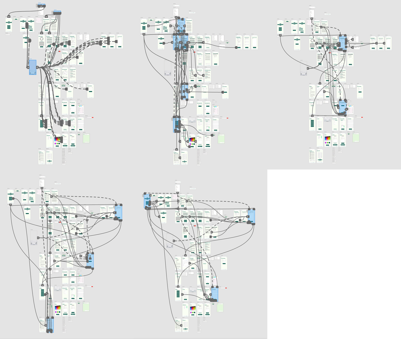
With my completed analog prototype, I executed user and usability testing. This testing indicated the design needed improvement to streamline functionality, as well as an evaluation of the assumptions I’d made about the user’s technical literacy. This testing led me to design a sticky nav that anchors to the bottom of the screen and an initial optional feature/function tutorial. Additionally, I designated the “progress” screen as the home screen after the user has logged in to their account. I made numerous other tweaks to the interface and experience based on user feedback.
Wireframes
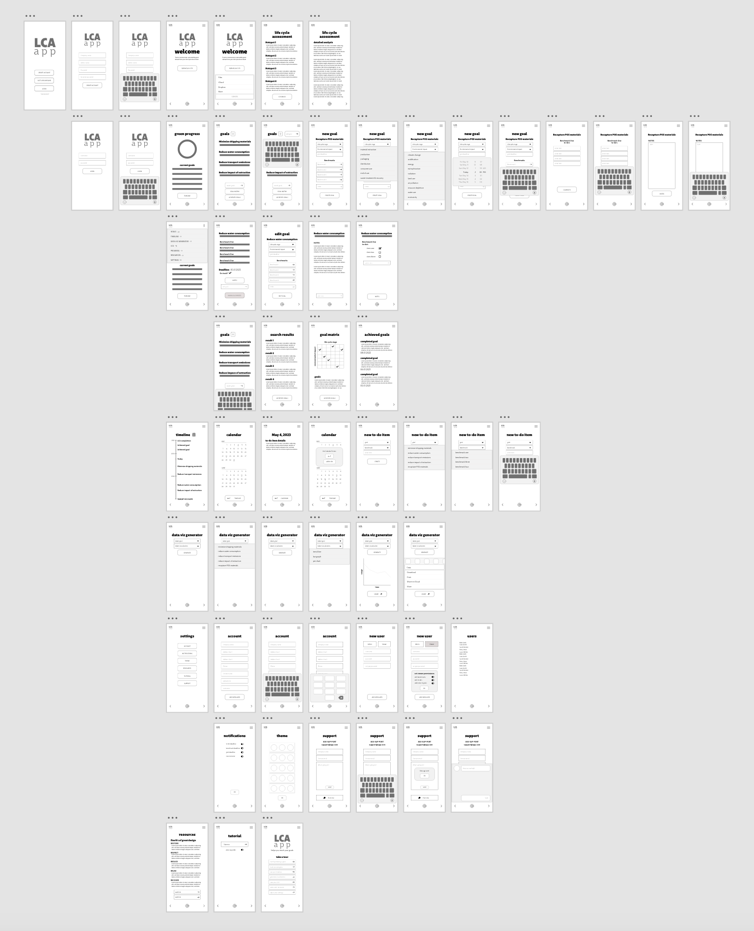
At this point, the app didn’t yet have a name, but I was ready to begin designing digitally. I moved into the computer, and paired my user feedback with my analog prototype to create the first draft of wireframes for the app. As I was designing the wireframes, I worked on the UI design—including layouts, iconography, buttons, bars, typography, and colors. I landed on the name “Verdant” for the app because of the connotation of a green, healthy environment.
User Interface Design
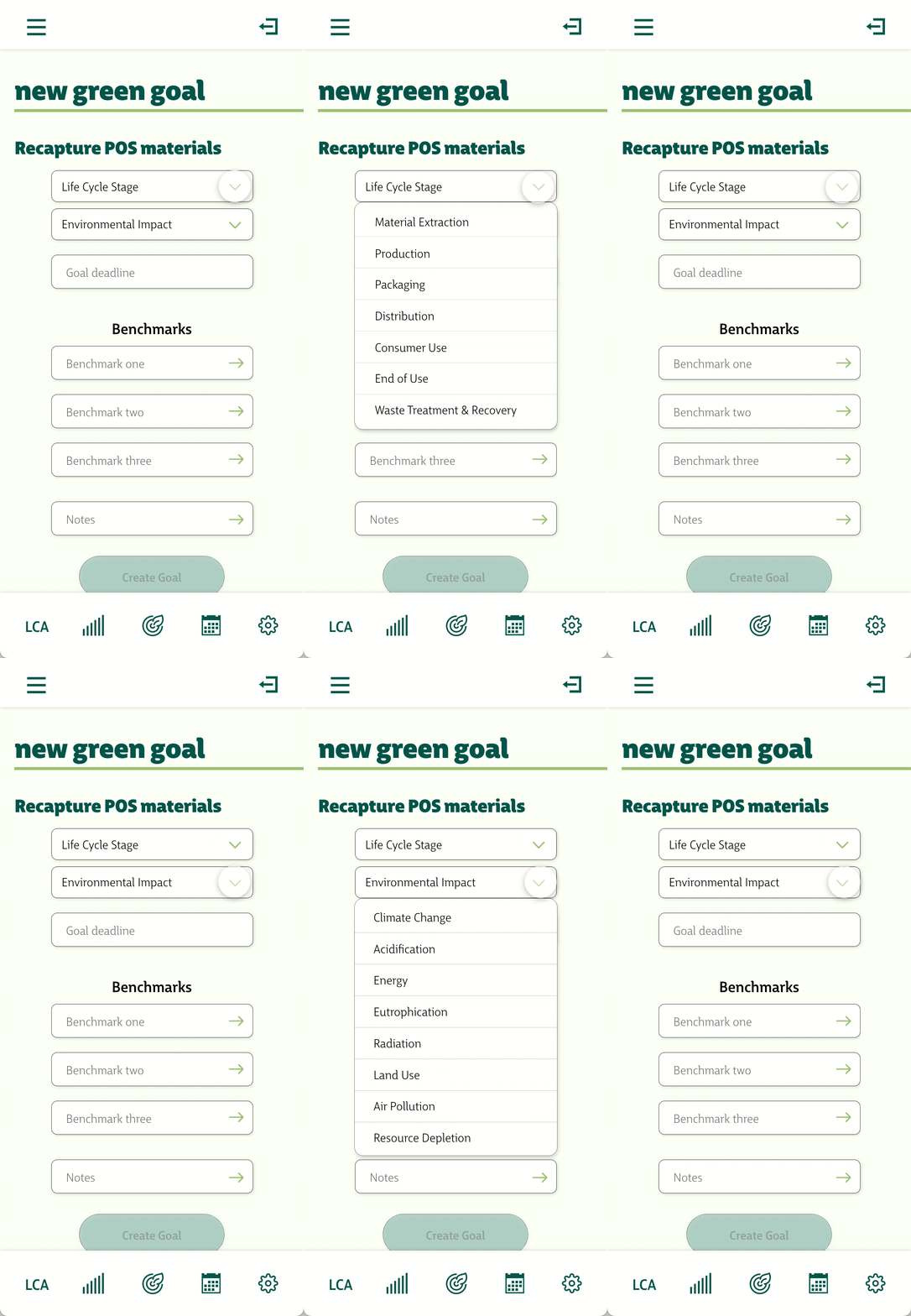
The UI for Verdant features a comprehensive brand identity system including rules for typography, color, and spacing. There are also guidelines for the display of data, specialty graphics, and custom iconography.
I designed Verdant to be used to circulate information regarding sustainability metrics from person to person and interdepartmentally within a corporate structure, as well as with key stakeholders.
Verdant comes together as a powerful tool for tracking, communicating, and achieving corporate sustainability goals.


