Tilley Properties
WEBSITE REDESIGN PROJECT
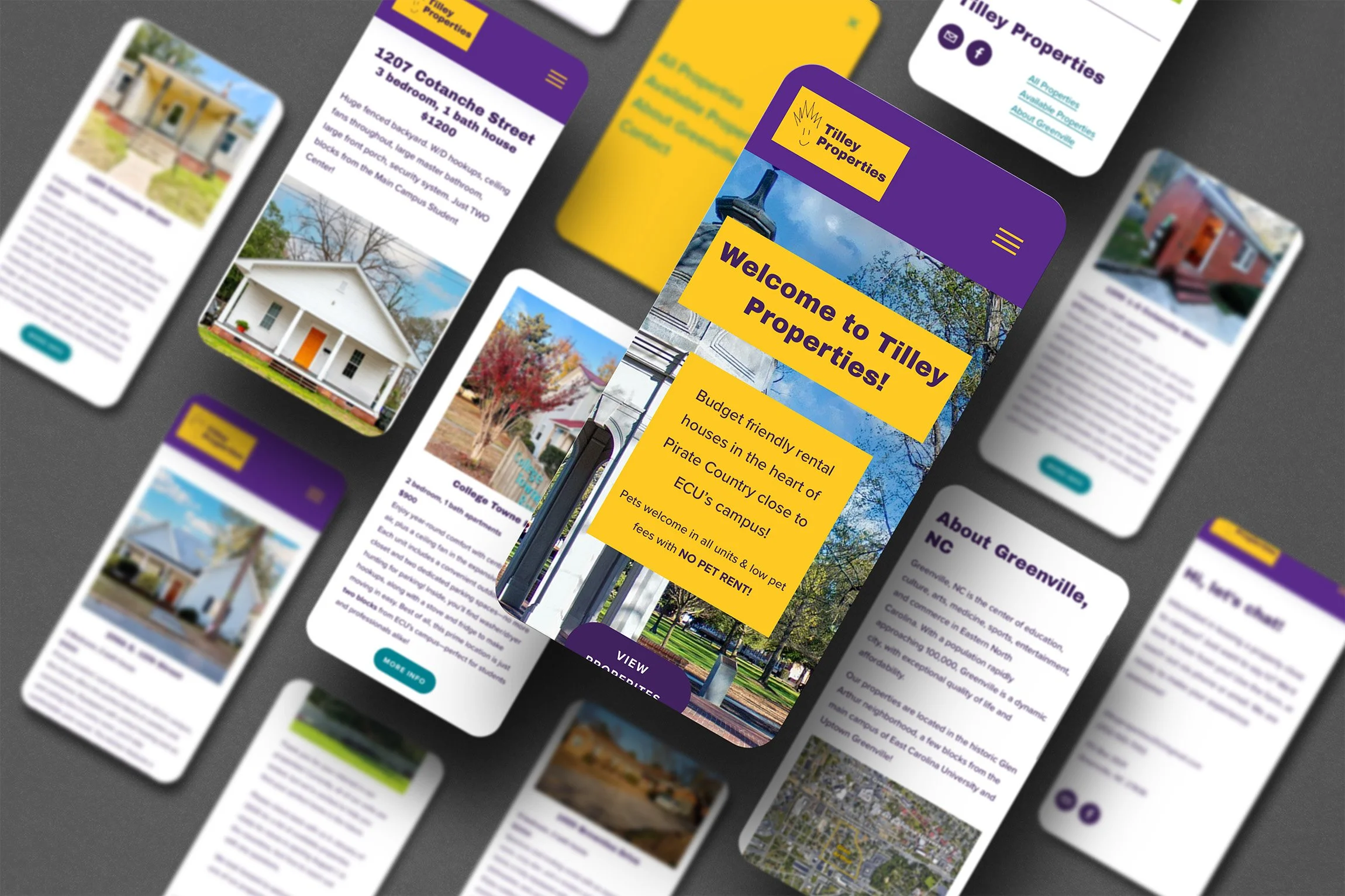
Tilley Properties approached me seeking a full website redesign to enhance their digital presence, improve and streamline user experience, and increase engagement with their brand. As an established Property Management business, they wanted a site that would not only reflect their expertise but also make it easy for visitors to navigate their services and connect with their team. Most importantly, they wanted their website to reflect their unique value proposition in the rental property market.
At the outset of this project, I determined several objectives with the input of the client. Primarily, the website needed to increase brand visibility and elevate the brand identity. This included updating the user interface of the website into a cohesive, modern design while remaining authentic to the values of Tilley Properties.
Additionally, user experience across the website needed improvement. I set goals to simplify the navigation and guide users intuitively in order to increase conversion rates.
Finally, I noted the website would benefit from optimization for performance and search ranking. I worked to keep the pages lightweight for fast load times and utilized SEO best practices throughout the structure. Improvements in the website’s responsiveness and usability were also noted as objectives.
The Website Before
When I first evaluated the state of the “before” website, several things stood out to me—across the user interface, the information architecture and the user experience.
Tilley Properties is a family-owned, friendly small business. The dark photo on the home page and dark theme across much of the site weren’t serving to communicate these key aspects of the business. The home page also featured five separate text movements, three of which occurred simultaneously once the page loaded. These movements gave the site an antiquated feel, not to mention the pure strangeness of the bouncing footer.
The UI had numerous design and accessibility issues. In addition to a slew of moving text, much of the copy writing was styled with a drop shadow or outer glow. There were contrast issues both in the main nav and where text appeared over images. A peculiar choice was made to feature a darkened city skyline behind the title and description of the properties—odd given that Greenville, NC is a small town of fewer than 100,000 folks with no skyscrapers.
The main nav and logo overlapped throughout the site in the header, initiating confusion about how to navigate the site. The info architecture was also unclear, especially regarding the difference between “properties” and “addresses” and the difference between “about” and “team.” (Turns out, the “about” page showcased information about the town).
Inconsistencies abounded in how to view photos of each property, how to navigate between property pages, where to find contact information, and how to determine if any rental units were available.
I took all of this into consideration when designing the look, feel, and function of the new site. In addition to focusing on getting the site to rank higher in search results.
The first choice I made was to simplify and clarify the main nav. We decided to add an “Available Properties” page to showcase the main information users want, while combining and eliminating unnecessary pages.
I added contact info to every page in the footer, created the proper email and phone links, and added a contact form to capture additional leads.
This website redesign was comprehensive, it not only covered user experience, user interface, optimization, and information architecture issues, I also executed copywriting overhauls and captured fresh property photographs.
In the first month after launch, the site saw a nearly 400% increase in unique visitors. In every month since, the number of unique visitors has never dipped below a threefold increase from before the redesign.
The streamlined user flows, improved navigation and presence of a contact form now lead to inquiries, directly contributing to the client's lead generation goals.
Feedback from the Tilley Properties team and their customers highlighted the improved professionalism and cohesiveness of the new site, reinforcing their position as a leader in the local rental housing industry.


