Legacy
This is a brand identity concept for the Legacy Conference that takes place at East Carolina University. The Legacy Conference aims to examine the past, present, and future of design to deconstruct our past, understand our current realities, and speculate on our future possibilities.
The Legacy Conference is a two-day experience hosted by the Graphic Design Area in the School of Art + Design at East Carolina University. The conference seeks to look to the future with a critical and curious eye, imagining new paths forward to shift future outcomes.
Guiding queries for the conference include: What design legacies have shaped our present and what new legacies do we hope to set forward? We question: What happened then, how does that shape now, and what do we hope for next?
Design Process
Sketching
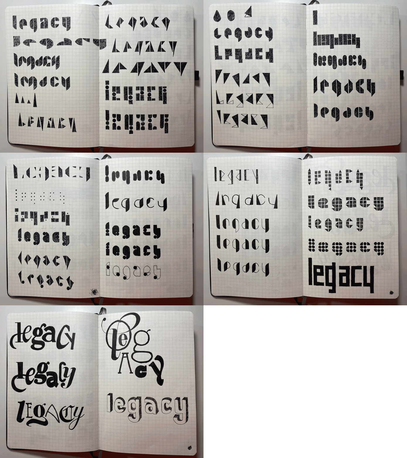
The initial phase of my design process for creating this conference brand identity was to put pen to paper and sketch. Sketching and word lists are the first stage of my process for nearly all design projects. By starting with physical materials, I can quickly iterate through ideas—yielding a rich foundation of concepts. This provides me with much fodder for exploration once I move into working digitally. I review my sketches by pinning them up, stepping back, and marking the ones I deem most effective with star stickers.
Type Study
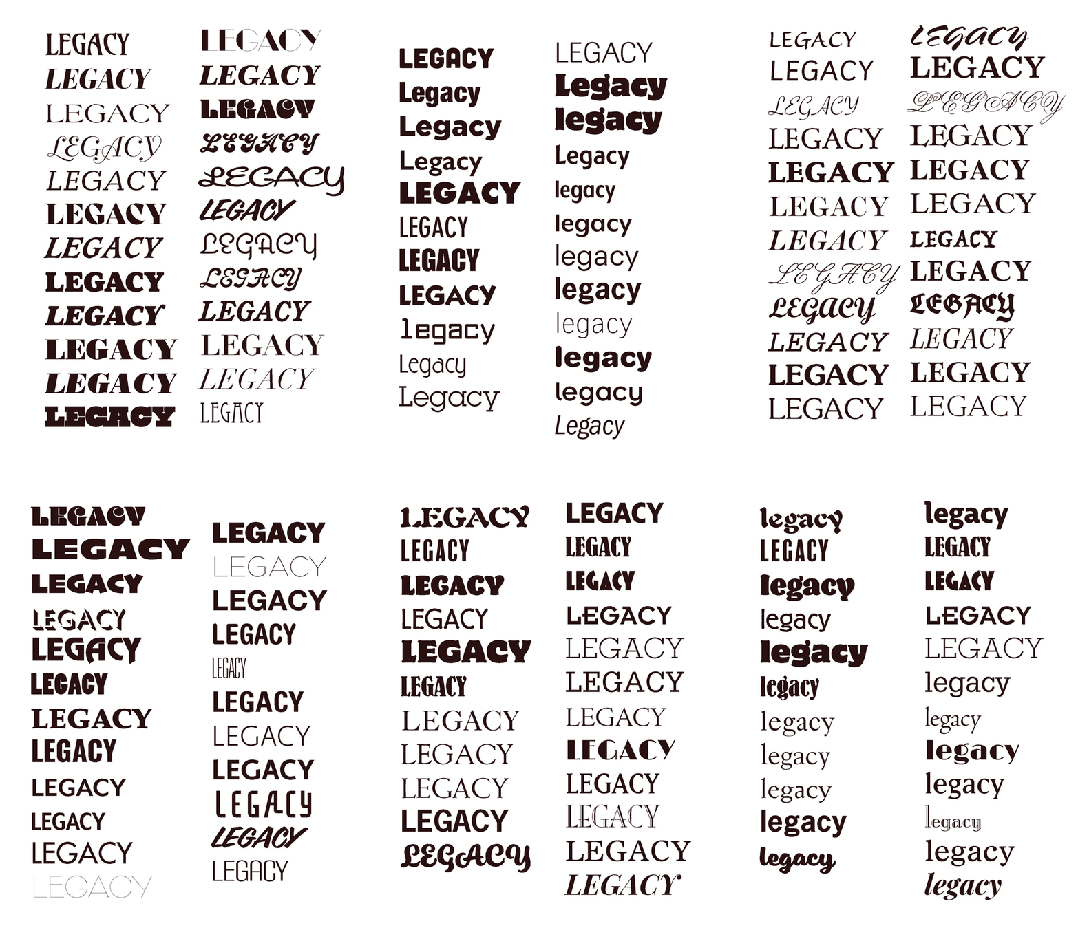
Alongside sketching on pen and paper, I executed a type study utilizing established typefaces. In addition to it being important to explore the interplay of the letterforms, I knew that the client wanted a type-forward brand identity. I wanted to explore a wide range of typographic options to identify how the characters could embody the brand’s personality.
Initial Pitches
After working through sketching and creating a type study, I put together some poster concepts for presentation to the client. Feedback at this step indicated the client was most enthused by the modular type concepts. They also indicated a preference for some of the versions of the modular type that I’d kept in sketches and not broken out into the poster presentation. Primarily, they felt concerned about the legibility of the word “legacy” when it was solely comprised of rectangular forms.
Modular Typeface & Color
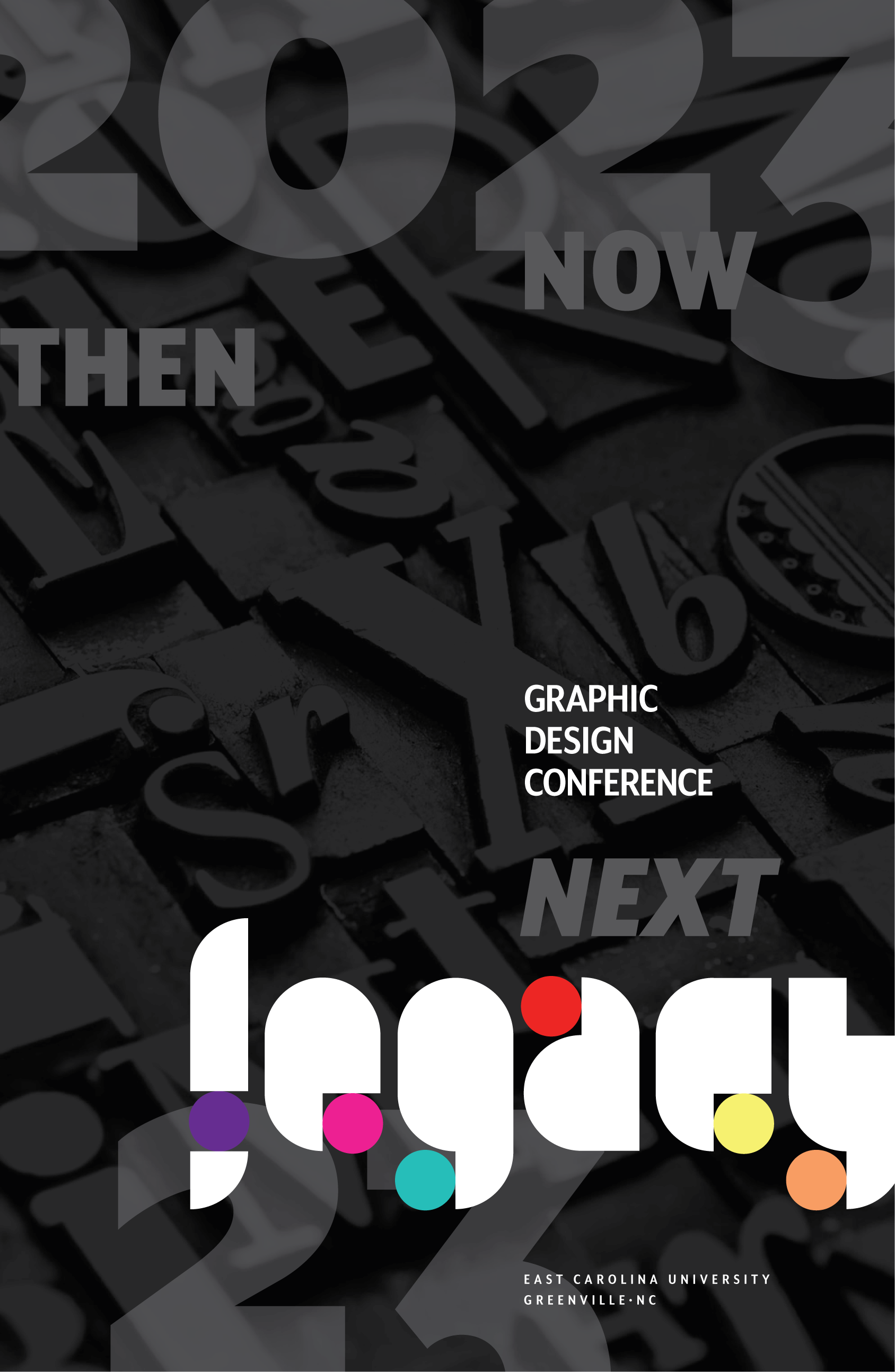
Based on feedback from colleagues and the client, I moved forward with the concept of a modular typeface. I developed an alphabet of lowercase letterforms, all derived from the square, quarter circle, and circle.
This modular typeface reflects the conference theme of “legacy,” which aims to honor the 100th anniversary of the coined term, “graphic design,” by celebrating diverse (and expanded on) histories and its many possible future trajectories.
In tandem with developing the modular type, I honed in on a color palette. I developed this palette to reflect the brand’s voice and guiding words: dynamic, energetic, engaged, youthful, and flexible.
The custom mark for Legacy with the color palette integrated.
Above: Adverts showcasing the flexible visual system for the conference (custom mark, color palette, type system) and tagline “Then. Now. Next.”
Below: Touchpoints in the Legacy visual identity system including merch and swag for attendees, a website, nametags and t-shirts for event staff, and promo materials.
Ultimately, this work was not selected. But I am still proud of it.


